Internal communications design is our not-so-secret weapon for building employee engagement with written materials. As a reader there’s nothing more daunting than a wall of words staring back at you. By including more color, graphic elements, photography and even illustrations we can add visual interest and give readers a place to rest their eyes. Good design not only makes it more likely that employees will actually engage with your article, post or newsletter (read more here) — it also can help chunk the copy into more manageable pieces to increase comprehension.
Here are four tips to consider for your internal communications design:
Flex your brand identity with graphic elements.
A brand identity is a huge investment and a powerful unifier for communications.
Consistency builds trust with the reader and shows professionalism and a level of care in the communications presented. But don’t be afraid to find fresh way to express that brand identity — while staying within brand guidelines.
Think about using shapes and graphic elements to create the grid for the article. Include a visual element between paragraphs to help guide the reader through the copy. You can also use shapes as containers for photography or the paragraphs themselves.
Include photography to provide context.
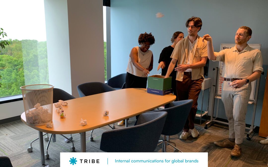
Human beings respond to pictures of other human beings. Including employee photography in your internal communications design attracts readers and helps build emotional connections to those who are featured. Reserve stock photography for conceptual or symbolic images, rather than using stock photos of models to represent employees. (Read more about why we counsel our clients to invest in employee photography in this one-pager.) much needed context and help illustrate a complex idea. If you’re writing an event recap include photos of the speaker and participants.
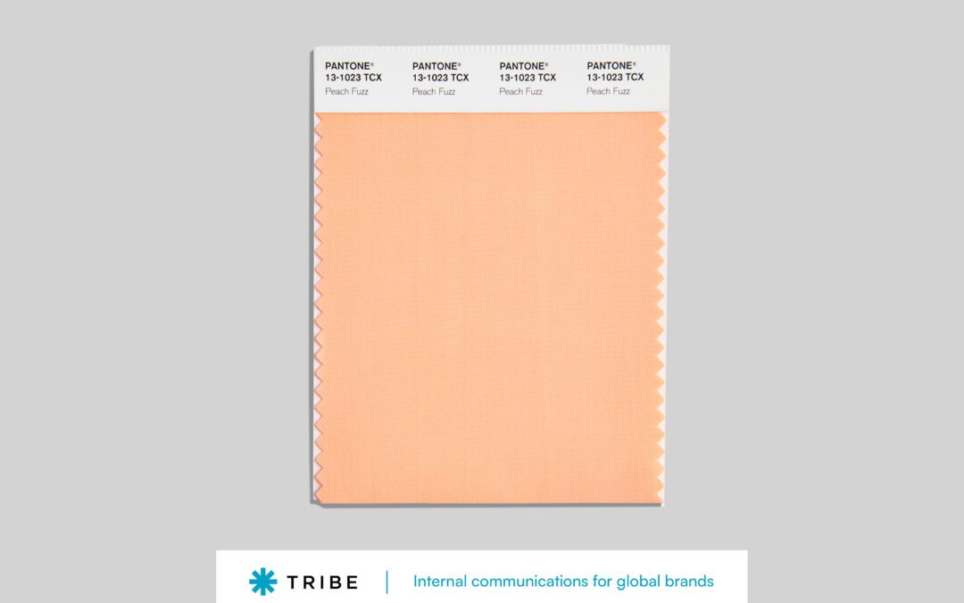
Incorporate secondary and tertiary color palettes.
One thing that’s different between brand materials for an external audience and internal communications design is that externally your brand is seen alongside lots of other brands. Internal communications appear in something of a vacuum, accompanied primarily by other internal communications.
For that reason, we often recommend looser brand restrictions on use of color for internal communications design. We might incorporate the less frequently seen secondary and tertiary palettes or use different saturations of brand colors. Color can help separate elements and topics — but one word of caution: don’t go crazy using too many colors at once. Keep it simple so the colors have a chance to stand on their own.
Entice the reader with callouts
Callouts are incredibly helpful in internal communications design not just because they add an interesting visual element. They also give readers an easy entry point to the copy that may encourage them to read to further. And if they only read the callouts, they’ll still get some important elements of the communication.
Explore interesting formats when designing the callouts. Try boxing the callouts, reversing them out of color blocks, adding oversized quotation marks, or accompanying them with a photo or icon.
Interesting in improving your internal communications design? Tribe can help.